Data Analysis in Excel is a niche skill that allows you to understand your data using natural language queries. This means you can ask questions about your data in Excel without having to write complicated formulas. How cool is that! In addition, for easier data analysis excel provides high-level visual summaries, trends, patterns, etc.
So, now let us take a look at the steps to analyze data in Excel.
Excel functions to know for Data Analysis
The common functions to perform data Analysis in Excel are given below:
1. The Data Analysis tool pack (Add-in) is a handy tool for conducting statistical tests and making inferences. For this, you need a basic knowledge of statistics. Further, for data cleaning and categorization, you must perform steps such as Text to Columns, Removing Duplicates, TEXT, LEFT, MID, RIGHT, DATE, EOMONTH, and TIME.
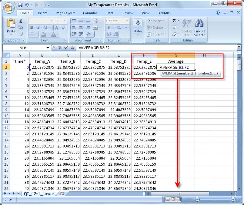
Data analysis is about telling a story-driven mainly by numbers. We all know that typical numbers calculations involve steps such as counting, summation, and conversion into %age, ranks, or quartiles/deciles. This may be achieved by using functions like COUNTIFS, SUMIFS, AVERAGEIFS, QUARTILE, and RANK.
2. To use Excel for model creation, we must use commands such as IF, AND, OR, VLOOKUP, MATCH, INDEX, INDIRECT, and LOOKUP.
As much as possible, we must convert tables and numbers into more understandable graphical information in the form of Charts and Sparklines. Bar and Column graphs can be employed for comparison, and Line graphs are useful for depicting trends over a period of time.
3. When talking of Excel skills, what skill is more valuable will depend on where you work. In certain work environments, one skill set will be considered more valuable than another, so you must adapt and learn based on your organization.
4. Last but not least – Pivots – both Simple & Power Pivots – are useful for converting a large amount of data into concise information in a short time.
Creating Graphs & Charts in Excel
Often Data has to be represented as Bars and Charts for faster analysis and presentation. So, let us look at the steps to be followed to create graphs and charts in Microsoft Excel.
The steps for making graphs that depict a given data values are as given below:
Step 1: Open Excel on your computer.
Step 2: Add the data that you want to represent pictorially to the excel spreadsheet either manually or by importing.
Step 2: Go to the Number section under Home to choose the suitable data type for the data columns. The data values can be accurately set up and represented by choosing the appropriate data type.
Step 4: Click on Insert, next to the Home menu.
Step 5: Select the best graph for your data, considering the type of data and other criteria you are working with.
Step 6: You can select multiple cells if you want to by dragging the mouse after clicking on one value.
Step 7: Select the suitable graph based on your data type. As soon as you do this, you’ll see that a graph will appear on the sheet.
Different Types of Graphs and Charts for Data Analysis
The important points of various popular graph and chart models in Excel are given below.
- Line Graphs: These are the most typical type of graphs. Every version of Microsoft Excel provides 2D and 3D line graphs to users.
- Bar Graphs: MS Excel provides bar graphs to show how the values of the given data change over time. In a bar graph, the constant parameter (e.g., time length) is allocated to the y-axis, and the variable parameter is displayed on the x-axis.
- Column graphs: They serve a similar purpose as bar graphs, but when there are several parameters, it becomes easy for the viewers to understand how the variations are created.
- Pie Charts: Pie charts can effectively display values as a percentage of the total. Varying colors are used to symbolize the value of each component. In Excel, Pie charts can only have eight divisions.
- Area Charts: Traits of line graphs and bar graphs are combined in an area chart. It resembles a line graph with shading along the bottom of the line. An area chart’s coloring usually conveys extra information.
- XY Graphs: A graph displaying various ordered pairs on an X-Y axis is called an X-Y graph (coordinate graph or scatter plot or Cartesian coordinate system). X-Y graphs are employed to depict mathematical calculations, examine data sets, and identify patterns.
Summing up
Excel can be used as a very handy tool in the Data analysis field. Hence, you must join a reliable Data analysis certification course to learn about every detail of Data analysis using Excel in-depth. This will make sure that you are not lagging behind in the career race to secure the top-paying jobs in Data Analysis.


Be First to Comment