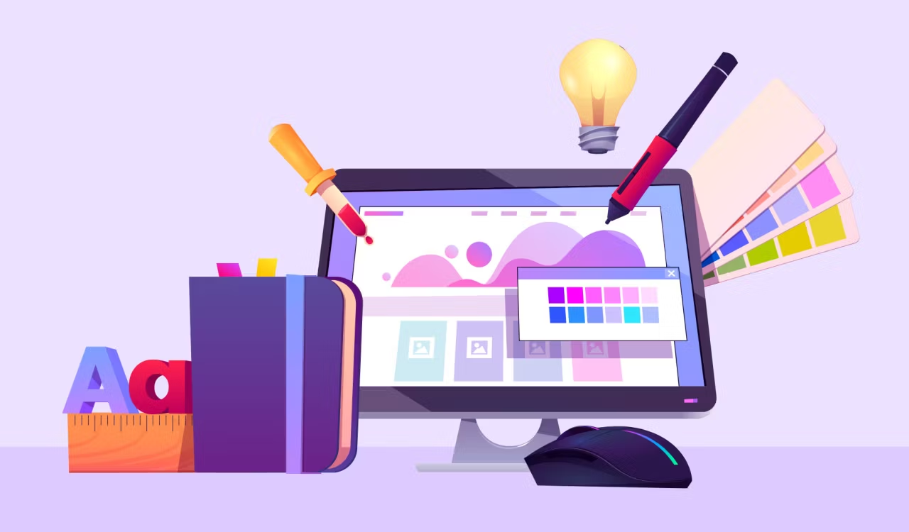
Color is one of the most important elements in web design. It plays an integral role in creating and maintaining user engagement, as well as establishing a strong brand identity.
But when it comes to designing for different devices, color can be tricky. Responsive web design requires careful consideration when choosing colors so that they look great no matter what device or screen size you’re working with.
Below are some tips to help you use color effectively in responsive web design, including why color is so important.
Why Color Matters When It Comes to Responsive Design
Color can have a huge impact on how users interpret and interact with your site.
For instance, warm colors such as reds and oranges create an energetic atmosphere that encourages people to take action.
Meanwhile, cool blues and greens create a calming atmosphere that encourages relaxation.
By carefully considering the colors you use in your design, you can subtly influence user behavior and create an optimal experience for each device.
1. Use Color Gradients
Color gradients are a great way to add visual interest to your design without using too many different colors.
They also work well with responsive web design because they create smooth transitions between color shifts, which can help make the transition from one device size to another feel more seamless.
2. Stick With Large Color Palettes
When picking colors for your design, it’s best to stick with large color palettes.
Smaller color palettes may be easier to work with in the short-term, but they can cause problems when scaling up or down for different devices.
Large palettes give you more room to play around and create a design that looks great on any device.
3. Focus on Contrast
When picking colors for different elements in your design, it’s important to pay attention to the contrast between them.
Different devices may display colors differently, so make sure that there is enough contrast between your colors to make them stand out no matter what device they’re being viewed on.
4. Choose Colors That Complement Your Brand
Choosing colors for your design is an important process. You’ll want to think about how they fit into your brand identity.
Colors that match or complement your branding can help you create a consistent look and feel across all devices.
5. Consider Accessibility
When designing with color, it’s important to consider how color-blind or visually impaired users might experience your design.
Following accessibility guidelines or using tools like Contrast Ratio can help you make sure that everyone can access and enjoy your design, regardless of their abilities.
6. Adaptable for Multiple Devices
Remember that colors should be adaptable for multiple devices. Mobile screens tend to have lower resolutions which can affect how colors are displayed.
Make sure that your colors look great on all devices by running tests before you launch your design.
If you’re struggling to decide which colors are best for mobile design, read this guide for mobile branding colors.
7. Use a Limited Number of Colors
The key to creating a successful design with color is to use a limited number of colors.
This will help ensure consistency no matter what device your users are viewing it on.
Limit yourself to just 1-3 colors for the primary elements in your design and use shades, tints, and accents to add depth without adding too many colors.
8. Test, Test, and Test Again
Make sure to test your design with real users on multiple devices.
This will help you spot any problems with color that may not be obvious in the design process.
Testing can also reveal unexpected insights into how people are using or interacting with your design – which can give you valuable feedback for future iterations of the design.
UAT, or acceptance testing is a crucial step for keeping web design functional as well. Find information on UAT Testing here.
9. Utilize Color Psychology
Last but not least, you’ll want to consider the psychology of color when designing with it.
Different colors can evoke different emotions and create an atmosphere for users.
For example, yellow is often used to create a feeling of optimism and cheerfulness, while blue is often used to create a more calming atmosphere.
Understanding the psychological impact of color can help you create a more emotional and engaging design.
Conclusion
Using color effectively in responsive web design can be a tricky endeavor. By following the tips outlined above, you’ll be able to create a successful design that looks great on any device or screen size.
Remember to focus on core issues like large color palettes, focus on contrast and choose colors that complement your brand identity while also considering accessibility guidelines.
With these tips in mind, you should have no problem creating an effective and visually appealing website for all users, regardless of their devices.


Be First to Comment