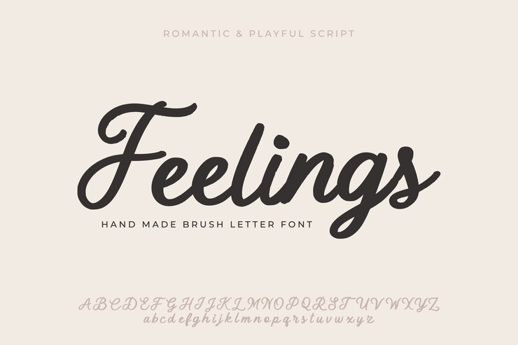
Typography, the silent art form shaping our reading experiences, carries within it the power to evoke emotions, convey messages, and define aesthetics. Among the diverse array of font styles, one stands out with a timeless and versatile appeal—Sans Serif Fonts. In this exploration, we delve into the fascinating world of sans-serif, uncovering its origin, evolution, and the reasons behind its enduring popularity.
Origin and Evolution:
*1. Breaking Tradition: The term “sans-serif” translates to “without serifs.” Serifs are the small decorative strokes or tails at the end of characters, a characteristic feature of traditional serif fonts. Sans-serif fonts, by intentionally omitting these embellishments, emerged as a departure from the ornate and formal styles prevalent in traditional typography.
*2. The Birth of Modernity: The late 19th century witnessed the rise of sans-serif fonts as a reflection of the modern era. Design movements like Bauhaus embraced the simplicity and functionality of sans-serif, aligning with the principles of contemporary design. Fonts like Helvetica, introduced in the mid-20th century, epitomized the clean, geometric shapes that define sans-serif aesthetics.
Characteristics and Versatility:
*1. Clean Lines and Simplicity: At the heart of sans-serif fonts lies their clean, unadorned lines. This simplicity enhances readability, making sans-serif a preferred choice for various applications, especially in digital interfaces. The absence of serifs allows for a straightforward and modern visual language.
*2. Versatility in Design: Sans-serif fonts are inherently versatile, adapting seamlessly to different design contexts. Whether used in print or digital media, logos, or signage, sans-serif fonts convey a sense of clarity and modernity. Their neutrality allows them to complement a wide range of visual elements without overpowering the overall design.
Sans Serif in the Digital Age:
*1. Digital Readability: The digital age witnessed a surge in the use of sans-serif fonts, driven by their exceptional readability on screens. The absence of serifs reduces visual noise and contributes to a clean, streamlined appearance, enhancing the user’s reading experience on websites, apps, and other digital platforms.
*2. Brand Identity: Sans-serif fonts have become synonymous with many iconic brand identities. Companies seeking a contemporary, approachable image often opt for sans-serif in their logos and branding materials. The simplicity of sans-serif contributes to a brand’s ability to communicate a modern and forward-thinking ethos.
Design Tips and Best Practices:
*1. Choosing the Right Weight and Size: Sans-serif fonts come in various weights and sizes, allowing designers to play with emphasis and hierarchy. When selecting a sans-serif font, considering its weight in relation to the overall design and ensuring optimal readability at different sizes is crucial.
*2. Pairing with Other Fonts: While sans-serif fonts are known for their standalone appeal, they also pair well with other font styles. Designers often combine sans-serif with serif or script fonts to create visual interest and hierarchy. The key is to maintain a balance that enhances the overall aesthetic.
Conclusion
In the ever-evolving landscape of design, sans-serif fonts remain a beacon of modernity and adaptability. From their rebellious origins to becoming a staple in contemporary design, sans-serif fonts continue to shine across a spectrum of applications, leaving an indelible mark on the visual language of our digital era.


Be First to Comment